Create basic website layout with HTML CSS
This is going to be a short and basic tutorial meant especially for beginners. We will create a basic website layout with HTML CSS. Almost every website consists of this basic layout which includes a Header, Sidebar, Content Area, and footer.
We are going to use HTML’s DIV tag because this will be a DIV based design and we are only using HTML and CSS. DIV based designs are much efficient and results in much cleaner code as compared to table based designs. In table-based designs, we use <table> tag and its columns / Rows to build the layout which is not considered a proper way at all.
Let’s get started
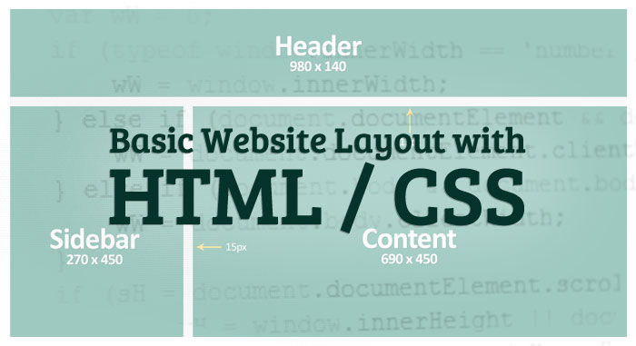
In the beginning, you will have the design which is either created by you or provided by another designer or client. You can see the design in the picture below.
Since this is only an empty demo design so, there are only four sections. Obviously, a complete website’s design will have more sections and once you learned to create this basic layout, then you will be able to create more sections easily.
HEAD section
<!DOCTYPE HTML>
<html>
<head>
<meta charset="utf-8">
<title>Demo Layout</title>
<link type="text/css" rel="stylesheet" href="css/style.css">
</head>
In this section, we have given a page title “Demo Layout” to this page and linked a stylesheet file style.css in css directory. If you don’t know these basics you can learn more about it here.
Body section
<body>

<div class="wrap">

	<div class="header">
  	</div><!-- .header -->

	<div class="content">
	</div><!-- .content -->

    <div class="sidebar">
    </div><!-- .sidebar -->

    <div class="clear"></div>

	<div class="footer">
	</div><!-- .footer -->

</div><!-- .wrap -->

</body>
</html>
As you can see, we are using DIV tags and have assigned classes to each one of them. We will use these classes later in the stylesheet file by calling the names of each assigned class.
We also added comments as the same name of each assigned class after each closing DIV. Adding comments considered a good practice and this also makes the code user-friendly for other users who might be editing or reading your code.
CSS
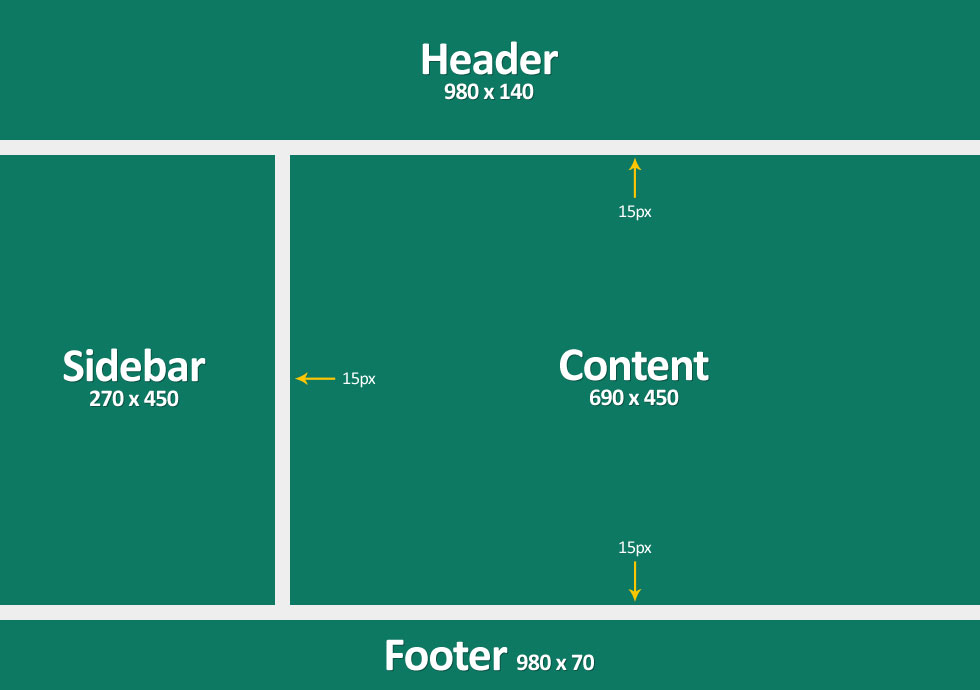
Before styling each section, you will need to know measurements such as the width and height of each section. These measurements will obviously differ from design to design. I use the “Ruler” tool in Adobe Photoshop to get the measurements by clicking and dragging from one point to another. Measurements for this basic layout can be seen in the design picture above. You can download the attached blank PSD design as well.
.wrap {
	width:980px;
	margin:0 auto;
}
As prominent by the name “.wrap”, this is called wrapping DIV which contains all other DIVs. You can obviously assign any other name such as a wrapper, container, or main_div, etc. but I prefer to call it .wrap appears clean and short.
We have given a width of 980 pixel wide and added top/bottom margin as 0 and right /left margin as auto. That auto margin on both sides makes our website centered aligned horizontally.
body { margin:0; padding:0; }
Just resetting the default margin and padding of the body.
.header {
	height:140px;
	margin-bottom:15px;
	background-color:#0d7963;
}
I hope this is pretty simple and explained by CSS property names that we have given it the height of 140px, bottom margin 15 pixels, and background color “#0d7963” using color code. I used the color picker tool to get color code in Adobe Photoshop.
.content {
	width:690px;
	height:450px;
	background-color:#0d7963;
	float:right;
}
.sidebar {
	width:275px;
	height:450px;
	background-color:#0d7963;
	float:left;
}
We added float property to make this DIVs floats. That way we can make these DIVs stand beside each other. Without float property, DIV would take the whole width of the page and new “.sidebar” DIV would start under “.content” DIV. You can swap the values of float to change the position of the sidebar to either on the left or right side.
.clear {
	clear:both;
}
As you noticed we used clear DIV which will probably be as it is in all other designs without any text or content in it. The purpose of this DIV is to clear the space for floating elements above otherwise footer DIV would ignore floating DIVs above and would snap to header DIV. Click here to learn more about the clear property.
.footer {
	height:70px;
	margin-top:15px;
	background-color:#0d7963;
}
Pretty simple as header DIV.
Complete HTML and CSS code
Here is the complete code for “Create basic website layout with HTML CSS”. You can also download the PSD design and HTML / CSS files from the sidebar above.
HTML
<!DOCTYPE HTML>
<html>
<head>
<meta charset="utf-8">
<title>Demo Layout</title>
<link type="text/css" rel="stylesheet" href="css/style.css">
</head>
<body>

<div class="wrap">

	<div class="header">
  	</div><!-- .header -->

	<div class="content">
	</div><!-- .content -->

    <div class="sidebar">
    </div><!-- .sidebar -->

    <div class="clear"></div>

	<div class="footer">
	</div><!-- .footer -->

</div><!-- .wrap -->

</body>
</html>
CSS
body { margin:0; padding:0; }

.wrap {
	width:980px;
	margin:0 auto;
}
.header {
	height:140px;
	margin-bottom:15px;
	background-color:#0d7963;
}
.content {
	width:690px;
	height:450px;
	background-color:#0d7963;
	float:right;
}
.sidebar {
	width:275px;
	height:450px;
	background-color:#0d7963;
	float:left;
}
.footer {
	height:70px;
	margin-top:15px;
	background-color:#0d7963;
}
.clear {
	clear:both;
}
This “Create basic website layout with HTML CSS” is a basic tutorial for beginners. You can check more HTML tutorials here. More advanced tutorials are coming soon.